YITU-EN
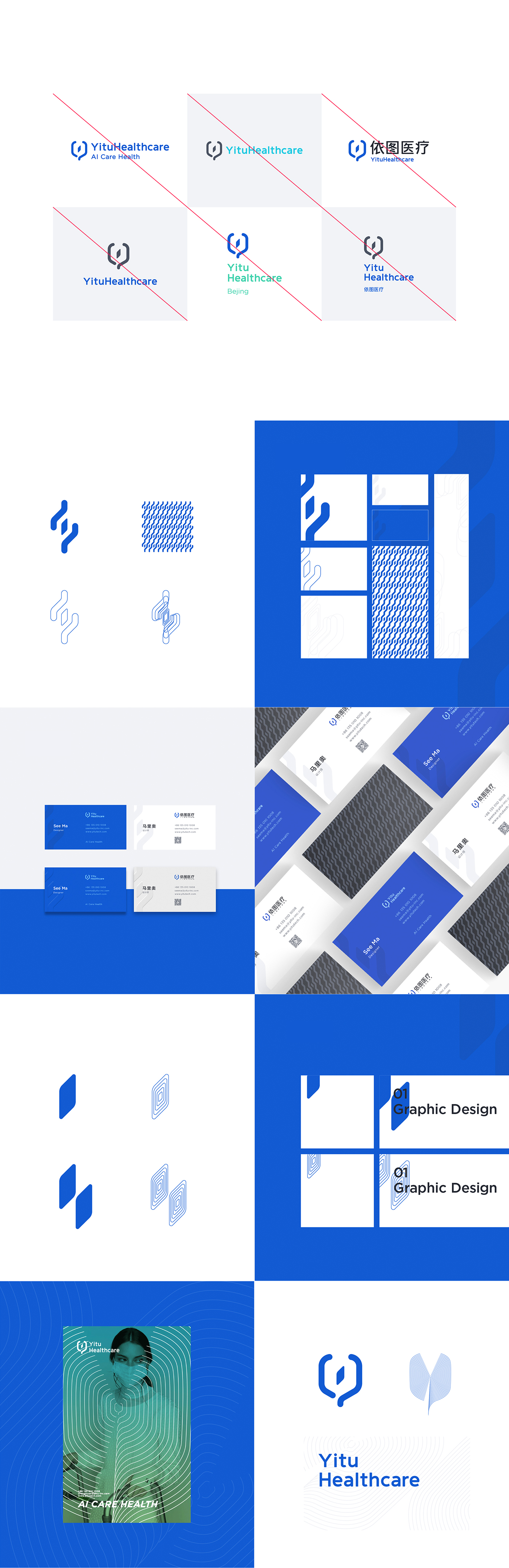
With the keywords of Artificial Intelligence, Medicine and Care, the logo indicates a deep integration between the Yitu Company and the medical industry, with the outline of the logo reflecting the shape of stethoscope and the letter Y. Meanwhile, the square inside the logo is an abstract expression of a chip, indicating the core technology of artificial intelligence. The logo also gives a dynamic touch since the chip and the stethoscope look like spinning in 3D space, an embodiment of the integration of traditional medicine and artificial intelligence. With such design, the logo expresses the industry vision of inseparability between AI and medicine, as well as the ideology of AI CARE Health of Yitu Company.
With the keywords of Artificial Intelligence, Medicine and Care, the logo indicates a deep integration between the Yitu Company and the medical industry, with the outline of the logo reflecting the shape of stethoscope and the letter Y. Meanwhile, the square inside the logo is an abstract expression of a chip, indicating the core technology of artificial intelligence. The logo also gives a dynamic touch since the chip and the stethoscope look like spinning in 3D space, an embodiment of the integration of traditional medicine and artificial intelligence. With such design, the logo expresses the industry vision of inseparability between AI and medicine, as well as the ideology of AI CARE Health of Yitu Company.
YITU-CN
根据人工智能、医疗、关爱三个关键词,Logo的外部轮廓结合听诊器及公司首字母Y, 寓意公司与医疗行业的深度融合,同时辅以中心“芯片”突显人工智能的核心技术,高度抽象芯片为一个正方形,将芯片三维空间旋转与听诊器形成空间交错,寓意传统医疗和人工智能的融合。整个LOGO表达了AI与医疗密不可分的行业愿景,体现了AI CARE HEALTH的公司理念。
根据人工智能、医疗、关爱三个关键词,Logo的外部轮廓结合听诊器及公司首字母Y, 寓意公司与医疗行业的深度融合,同时辅以中心“芯片”突显人工智能的核心技术,高度抽象芯片为一个正方形,将芯片三维空间旋转与听诊器形成空间交错,寓意传统医疗和人工智能的融合。整个LOGO表达了AI与医疗密不可分的行业愿景,体现了AI CARE HEALTH的公司理念。